
Creating a rainfall forecasting dashboard of Kerala, India. A non-shiny dashboard for all seasons.
Arun Gopinath / 2022-03-03
A non-shiny dashboard for all seasons
Dashboards are exciting tools to present an idea in the most human-friendly form available. Ideas are infectious it took some time to fix the theme of my dashboard will be ‘Rainfall forecast of Kerala’. Indian meteorological department(IMD) is keen to release rainfall forecast of Kerala state, India number of times a day (usually three times). But the journey is not as smooth as expected.
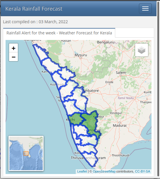
Mobile version of rainfall dashboard
Ideas and implemenation
The major drawback with these ‘IMD’ data is that all bulletins are in pdf format. ‘Tabulizer’ package comes in handy to scrape this pdf and converts data into dataframe. This data is joined with shapefile to plot in leaflet. But this dashboard is useless until it is automated. Github actions are super useful for these minimal processes.
Let’s dive in
Whole process is divided into three parts
- Data scrapping
- Dashboard creation
- Automation using github actions
Packages used
{tidyverse} {tabulizer} {lubridate} {janitor} {sf} {lubridate} {flexdashboard} {leaflet}
Part 1 - Tabulizer helps but..
Package ‘Tabulizer’ is super handy to scrape pdf files. But things may get weird sometimes. Weird tables are painful to extract. ‘extract_tables’ function gives a complex output.
# Source data

pdf <- "https://mausam.imd.gov.in/thiruvananthapuram/mcdata/district_rainfall_forecast.pdf"

# Collect data from pdf
warning <- extract_tables(pdf,
                                output = "matrix",
                                pages = c(1,1),
                                area = list(
                                  c(164.24098 , 32.80293, 708.75162 ,550.67989),
                                  c(149.44450,  29.84363, 164.24098, 555.11884  )),
                                guess = FALSE,
                                method = "stream")

# Convert both matrix to data.frames
data <- as.data.frame(warning[[1]])
header <- as.data.frame(warning[[2]])
I found that every third line of table is what I actually looking for. A half an hour internet search solves that problem.
# Date as header
data <- data[,-1]

data_tvm <- slice_head(data,n = 1)

row_tri <- seq_len(nrow(data)) %% 3  #  Table issues fixed
data_row_tri <- data[row_tri == 0, ]
Districts are assigned as headers. {Janitor} package helps to solve header issues and makes table good looking.
# Districts as headers
combined <- rbind(data_tvm, data_row_tri ) %>%
mutate(V1= c("Thiruvananthapuram","Kollam","Pathanamthitta",
            "Alappuzha","Kottayam","Ernakulam","Idukki",
            "Thrissur","Palakkad","Malappuram","Kozhikode",
            "Wayanad","Kannur","Kasaragode","Lakshadweep") )

# Reorder coloumns
combined <- combined[,c(6,1,2,3,4,5)]


warning_five <- rbind(header,combined) %>%
  row_to_names(row_number = 1)
To avoid complexity the output is saved as .csv format. All codes above are saved in ‘warn.R’ file. Later in the process this R file is called within dashboard Rmd file.
# Write output
write.csv(warning_five,"./data/weather_warn.csv", row.names = F,quote=F)
Part 2 - Flexdashboard and leaflet is a great combo.
I want this dashboard independent from server side approach of {Shiny}. Only solution I have right now is {flexdashboard}. Before choosing leaflet as mapping option {ggiraph} is tried but is avoided due to non-friendliness in mobile web browsers.
Previously created ‘warn.R’ is set to run within this ‘index.Rmd’ file. Shapefile of kerala state and output of ‘warn.R’ is loaded as shown below.
source("warn.R", local = knitr::knit_global())

map_in <- st_read("./data/kerala/kerala_lak.shp")

weather_a  <- read_csv("./data/weather_warn.csv")
IMD chooses another weird way of representing alerts with acronymns worse as possible. So you have to recode to display it beautifully.
# re-code

weather_a[weather_a == "No rain"] <- "No alert"
weather_a[weather_a == "L." ] <- "Green alert"
weather_a[weather_a == "L. to M" ] <- "Green alert"
weather_a[weather_a == "L to M" ] <- "Green alert"
weather_a[weather_a == "VL" ] <- "No alert"
weather_a[weather_a == "VL." ] <- "No alert"
weather_a[weather_a == "M" ] <- "Yellow alert"
weather_a[weather_a == "M." ] <- "Yellow alert"
weather_a[weather_a == "M. to H" ] <- "Yellow alert"
weather_a[weather_a == "M to H" ] <- "Yellow alert"
weather_a[weather_a == "H" ] <- "Orange alert"
weather_a[weather_a == "H." ] <- "Orange alert"
weather_a[weather_a == "VH" ] <- "Red alert"
weather_a[weather_a == "VH." ] <- "Red alert"
weather_a[weather_a == "XH" ] <- "Red alert - Extremely heavy rainfall"
weather_a[weather_a == "XH." ] <- "Red alert - Extremely heavy rainfall"
Shapefile and csv data is merged with ‘merge’ function. Coloumn names represent dates. These values are stored for ease of use. Also, to avoid complex issues with changing headers values (date values) they are replaced with dummy variables.
# col

colnames(weather_a)[1] <- "Name_1"

# shp + csv

map_latest <- merge(map_in,weather_a, by ="Name_1") %>%
  filter(!grepl('Lakshadweep', Name_1))


# Col names

col2 <- sym(names(map_latest)[2])
col3 <- sym(names(map_latest)[3])
col4 <- sym(names(map_latest)[4])
col5 <- sym(names(map_latest)[5])
col6 <- sym(names(map_latest)[6])


# Select only date headers
col <- colnames(map_latest[2:6])

# Dummy date headers
map_ker <- map_latest %>%
  `colnames<-`(c("District","d1","d2","d3","d4","d5","geometry"))
Let’s move on to {leaflet} part. As a first step, rainfall warnings are categorised and are colour coded.
pal <-
  colorFactor(palette = c('White', '#188f14', 'Yellow', 'Orange', 'Red', '#8B0000'),
              levels = c("No alert","Green alert","Yellow alert","Orange alert",
                         "Red alert","Red alert - Extremely heavy rainfall"))
Since warning data is available for five days, each of them is added after adding a base tile (OSM). Setview is set after some iterations. For ease of use, layer controls are added with first layer always checked. An inset map is added to increase overall aesthetic value.
map <-leaflet(map_ker) %>%
  addTiles()  %>%

  # A base layer of Kerala to always visible

  addPolygons(fillColor  = pal(map_ker$District), fillOpacity = 0, color = "black") %>%

  # Day 1
  addPolygons(fillColor  = pal(map_ker$d1), fillOpacity = .5,
              popup = paste("Date: ",col2, "<br>",
                            "District: ",map_ker$District, "<br>",
                            "Rainfall alert: ", map_ker$d1, "<br>"), group = col[1]) %>%

  # Day 2
  addPolygons(fillColor  = pal(map_ker$d2), fillOpacity = .5,
              popup = paste("Date: ",col3, "<br>",
                            "District: ",map_ker$District, "<br>",
                            "Rainfall alert: ", map_ker$d2, "<br>") , group = col[2]) %>%

  #Day 3
  addPolygons(fillColor  = pal(map_ker$d3), fillOpacity = .5,
              popup = paste("Date: ",col4, "<br>",
                            "District: ",map_ker$District, "<br>",
                            "Rainfall alert: ", map_ker$d3, "<br>") , group = col[3]) %>%
  # Day 4
  addPolygons(fillColor  = pal(map_ker$d4), fillOpacity = .5,
              popup = paste("Date: ",col5, "<br>",
                            "District: ",map_ker$District, "<br>",
                            "Rainfall alert: ", map_ker$d4, "<br>") , group = col[4]) %>%

  # Day 5

  addPolygons(fillColor  = pal(map_ker$d5), fillOpacity = .5,
              popup = paste("Date: ",col6, "<br>",
                            "District: ",map_ker$District, "<br>",
                            "Rainfall alert: ", map_ker$d5, "<br>") , group = col[5]) %>%

  setView(lng = 76.5711, lat = 10.5, zoom = 7) %>%

  # More freedom to you

  addLayersControl(overlayGroups = col[1:5] ,
                   options = layersControlOptions(collapsed = T))%>%

  # add inset map
  addMiniMap(
    tiles = providers$Esri.OceanBasemap,
    position = 'bottomleft',
    width = 120, height = 120,
    toggleDisplay = FALSE) %>%

  # Only first layer need to toggle
    hideGroup(col[2:5])
Dashboard consists of two parts, one with map and other with warning explanation.
Rainfall alert
=====================================

Column {.tabset}
-----------------------------------------------------------------------

### Rainfall Alert for the week - Weather Forecast for Kerala
Info
=====================================
What does these alerts actually mean ?
| Type | Intensity of rainfall | Warning colour code |
|---|---|---|
| No alert | Very Light Rainfall (0.1 to 2.4 mm) | No warning (No action) |
| Green alert | Light rainfall (2.5-15.5 mm) | No warning (No action) |
| Yellow alert | Moderate (15.6-64.4 mm) | Watch (Be updated) |
| Orange alert | Heavy Rainfall (64.5-115.5 mm) | Alert (Be prepared) |
| Red alert | Very Heavy Rainfall (115.6-204,4 mm) | Warning (Take action) |
| Red alert | Extremely Heavy Rainfall (>204.4mm) | Warning (Take action) |
Part 3 - Automation using Github actions.
This part is the core of the project. Thanks Athul for the invaluable help in this part of work. For activation of github actions one have to create a folder named ‘workflow’ and create ‘anyname.yaml’. Job of this yaml file is to activate at scheduled time and run the task repeatedly. Basically, these actions will give you a working operating system to play with. Here, an ubuntu os is selected and necessary packages are installed and cached for further use. Finally whenever a change is detected in processed files, they will commit automatically. More info on github actions can be read here.
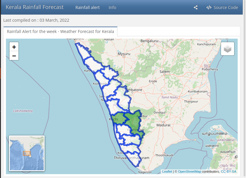
Desktop version of rainfall dashboard
Netlify solves rendering issues as smooth as possible. Source code is available on github.