
Exploratory Data Analysis of Covid 19 data of India
Arun Gopinath / 2021-08-03
- Exploring and visualising Covid 19 dataset of Indian states using R
- Exploratory Data Analysis
- First reporting case - When ? Where ?
- Peak active covid case in India - When ?
- Which day records maximum TPR in India?
- Highest death rate recorded ?
- Top 5 states with cumulative confirmed cases ?
- Least cumulative confirmed cases ?
- Most deaths - Top 5 ?
- Least deaths - State or UT ?
- Which state has most number of active cases ?
- Which state has least number of active cases ?
- Highest TPR ever recorded in a state ?
- Highest TPR 7 day moving average recorded ?
- Check weather any reletion between weekdays and Covid 19 deaths
- Daily cases in India
- Let’s see some interesting heat maps created using Plotly package.
- Maps tell more stories..
Exploring and visualising Covid 19 dataset of Indian states using R
Last update : Oct 31,2021
Covid 19 data is availabe publically and updates on daily basis. This is an attempt to explore the same with interesting questions all done using the power of “R”.
I will try to make sure to update the post on regular basis. So you can revisit this post again to see latest stats (atleast weekly update will be provided).
Load required packages
Load R packages needed for this data exploration and proper visualisation.
library(plotly)
library(tidyverse)
library(lubridate)
library(knitr)
library(kableExtra)
library(sf)
library(viridis)
library(glue)
library(scales)
library(widgetframe)
library(here)
Data… Data..
Data is obtained from Github.
- Removed “India” and “State unassigned” from ’State coloumn
- Calculate TPR rate = (Confirmed cases/Total tests)* 100)
- Calculate 7 day moving average of TPR
- Calculate active cases per state = Confirmed -(Recovered + Deceased)
- Calculate Mortality rate per confirmed cases = (Deceased / Confirmed ) * 100
- Calculate daily deaths
states <- read_csv("https://api.covid19india.org/csv/latest/states.csv")

states_daily <- states %>%
  filter(!(State %in% c("India","State Unassigned"))) %>%
  mutate(TPR = (Confirmed/Tested)* 100) %>%
  group_by(State) %>%
  mutate(Daily_cases = Confirmed - lag(Confirmed, default = 0)) %>%
  mutate(Daily_deaths = Deceased - lag(Deceased, default = 0)) %>%
  mutate(TPR_7d = zoo::rollmean(TPR, k=7,fill = NA)) %>%
  mutate(Active_cases = Confirmed -  (Recovered + Deceased)) %>%
  mutate(Mortality_rate = (Deceased / Confirmed ) * 100) %>%
  mutate(across(where(is.numeric), ~ round(., 3))) %>%
  mutate(Code = toupper(substr(State,0,3))) %>%
  ungroup()

states_daily$Date <- ymd(states_daily$Date)

covid_latest <- states_daily %>%
  filter(Date==max(Date)) %>%
rename(State_Name = State)- A national level data subset
# India_stats
India_stats<- states %>%
  filter((State %in% c("India"))) %>%
  mutate(TPR = (Confirmed/Tested)* 100) %>%
  group_by(State) %>%
  mutate(Daily_cases = Confirmed - lag(Confirmed, default = 0)) %>%
  mutate(Daily_deaths = Deceased - lag(Deceased, default = 0)) %>%
  mutate(TPR_7d = zoo::rollmean(TPR, k=7,fill = NA)) %>%
  mutate(Active_cases = Confirmed -  (Recovered + Deceased)) %>%
  mutate(Mortality_rate = (Deceased / Confirmed ) * 100) %>%
  mutate(across(where(is.numeric), ~ round(., 3))) %>%
  ungroup()

India_stats$Date <- ymd(India_stats$Date)
Loading latest shapefile of Indian states
Covid stats are merged with this shapefile for further analysis
# India latest map
map_in <- st_read(here("static","/data/india/India_State_Boundary.shp"))
## Reading layer `India_State_Boundary' from data source
## `/home/arungopinath/Public/arungopi.gitlab.io/static/data/india/India_State_Boundary.shp'
## using driver `ESRI Shapefile'
## Simple feature collection with 37 features and 1 field
## Geometry type: MULTIPOLYGON
## Dimension: XY
## Bounding box: xmin: 7583508 ymin: 753607.8 xmax: 10843390 ymax: 4452638
## Projected CRS: WGS 84 / Pseudo-Mercatormap_latest <- merge(map_in,covid_latest, by ="State_Name")Exploratory Data Analysis
This section is interesting because here we can explore our data to seek important and cool facts.
First reporting case - When ? Where ?
first <- states_daily %>%
  filter(Date==min(Date)) %>%
  select(Date,State,Confirmed) %>%
  kable() %>%
  kable_styling()
first| Date | State | Confirmed |
|---|---|---|
| 2020-01-30 | Kerala | 1 |
- State = Kerala & Date: 30 Jan,2020
Peak active covid case in India - When ?
Peak_day <- India_stats %>%
  arrange(desc(Daily_cases)) %>%
  top_n(1,Daily_cases) %>%
  select(Date,Daily_cases) %>%
  kable() %>%
  kable_styling()
Peak_day| Date | Daily_cases |
|---|---|
| 2021-05-06 | 414280 |
Which day records maximum TPR in India?
Peak_tpr <- India_stats %>%
  arrange(desc(TPR)) %>%
  top_n(1,TPR) %>%
  select(Date,TPR) %>%
  kable() %>%
  kable_styling()
Peak_tpr| Date | TPR |
|---|---|
| 2020-08-09 | 9.007 |
Highest death rate recorded ?
Peak_mortality <- India_stats %>%
  arrange(desc(Mortality_rate)) %>%
  top_n(1,Mortality_rate) %>%
  select(Date,Mortality_rate) %>%
  kable() %>%
  kable_styling()
Peak_mortality| Date | Mortality_rate |
|---|---|
| 2020-04-12 | 3.604 |
Top 5 states with cumulative confirmed cases ?
top_5 <- states_daily %>%
  filter(Date==max(Date)) %>%
  arrange(desc(Confirmed)) %>%
  top_n(5,Confirmed)%>%
  select(Date,State,Confirmed) %>%
  kable() %>%
  kable_styling()

top_5 | Date | State | Confirmed |
|---|---|---|
| 2021-10-31 | Maharashtra | 6611078 |
| 2021-10-31 | Kerala | 4968657 |
| 2021-10-31 | Karnataka | 2988333 |
| 2021-10-31 | Tamil Nadu | 2702623 |
| 2021-10-31 | Andhra Pradesh | 2066450 |
Least cumulative confirmed cases ?
least_affect <- states_daily %>%
  filter(Date==max(Date)) %>%
  arrange(desc(Confirmed)) %>%
  slice_min(order_by = Confirmed) %>%
  select(Date,State,Confirmed) %>%
  kable() %>%
  kable_styling()

least_affect | Date | State | Confirmed |
|---|---|---|
| 2021-10-31 | Andaman and Nicobar Islands | 7651 |
Most deaths - Top 5 ?
most_death <- states_daily %>%
  filter(Date==max(Date)) %>%
  arrange(desc(Deceased)) %>%
  top_n(5,Deceased) %>%
  select(State,Deceased) %>%
  kable() %>%
  kable_styling()

most_death | State | Deceased |
|---|---|
| Maharashtra | 140216 |
| Karnataka | 38082 |
| Tamil Nadu | 36116 |
| Kerala | 31681 |
| Delhi | 25091 |
Least deaths - State or UT ?
least_death <- states_daily %>%
  filter(Date==max(Date)) %>%
  arrange(desc(Deceased)) %>%
  top_n(-1,Deceased)%>%
  select(State,Deceased) %>%
  kable() %>%
  kable_styling()

least_death | State | Deceased |
|---|---|
| Dadra and Nagar Haveli and Daman and Diu | 4 |
Which state has most number of active cases ?
active_cases_top <- states_daily %>%
  filter(Date==max(Date)) %>%
  arrange(desc(Active_cases)) %>%
  top_n(1,Active_cases) %>%
  select(Date,State,Active_cases,TPR) %>%
  kable() %>%
  kable_styling()

active_cases_top | Date | State | Active_cases | TPR |
|---|---|---|---|
| 2021-10-31 | Kerala | 79795 | 13.115 |
Which state has least number of active cases ?
active_cases_least<- states_daily %>%
  filter(Date==max(Date)) %>%
  arrange(desc(Active_cases)) %>%
  top_n(-1,Active_cases) %>%
  select(Date,State,Active_cases,TPR) %>%
  kable() %>%
  kable_styling()

active_cases_least | Date | State | Active_cases | TPR |
|---|---|---|---|
| 2021-10-31 | Andaman and Nicobar Islands | 4 | 1.279 |
Highest TPR ever recorded in a state ?
tpr_highest <- states_daily %>%
  arrange(desc(TPR)) %>%
  top_n(1,TPR)%>%
  select(Date,State,Active_cases,TPR) %>%
  kable() %>%
  kable_styling()

tpr_highest | Date | State | Active_cases | TPR |
|---|---|---|---|
| 2020-06-15 | Telangana | 2240 | 22.204 |
Highest TPR 7 day moving average recorded ?
tpr_7_highest <- states_daily %>%
  arrange(desc(TPR_7d)) %>%
  top_n(1,TPR_7d)  %>%
  select(Date,State,Active_cases,TPR_7d) %>%
  kable() %>%
  kable_styling()

tpr_7_highest | Date | State | Active_cases | TPR_7d |
|---|---|---|---|
| 2020-07-08 | Telangana | 11933 | 21.287 |
Check weather any reletion between weekdays and Covid 19 deaths
# Calculate weekdays

India_stats <- India_stats %>%
  mutate(weekdays = weekdays(Date))

# Reorder weekdays
India_stats$weekdays <- factor(India_stats$weekdays, weekdays(as.Date('1970-01-03') + 1:7))
ggplot(India_stats, aes(x=weekdays, y=Daily_deaths)) +
geom_bar(stat="identity", width=.5, fill="tomato3")+
labs(title="Any relation between Weekdays and Daily deaths",
subtitle="Mondays have lowest reported deaths",
caption= glue("Last update: {max(map_latest$Date)}")) +
theme(axis.text.x = element_text(angle=65, vjust=0.6))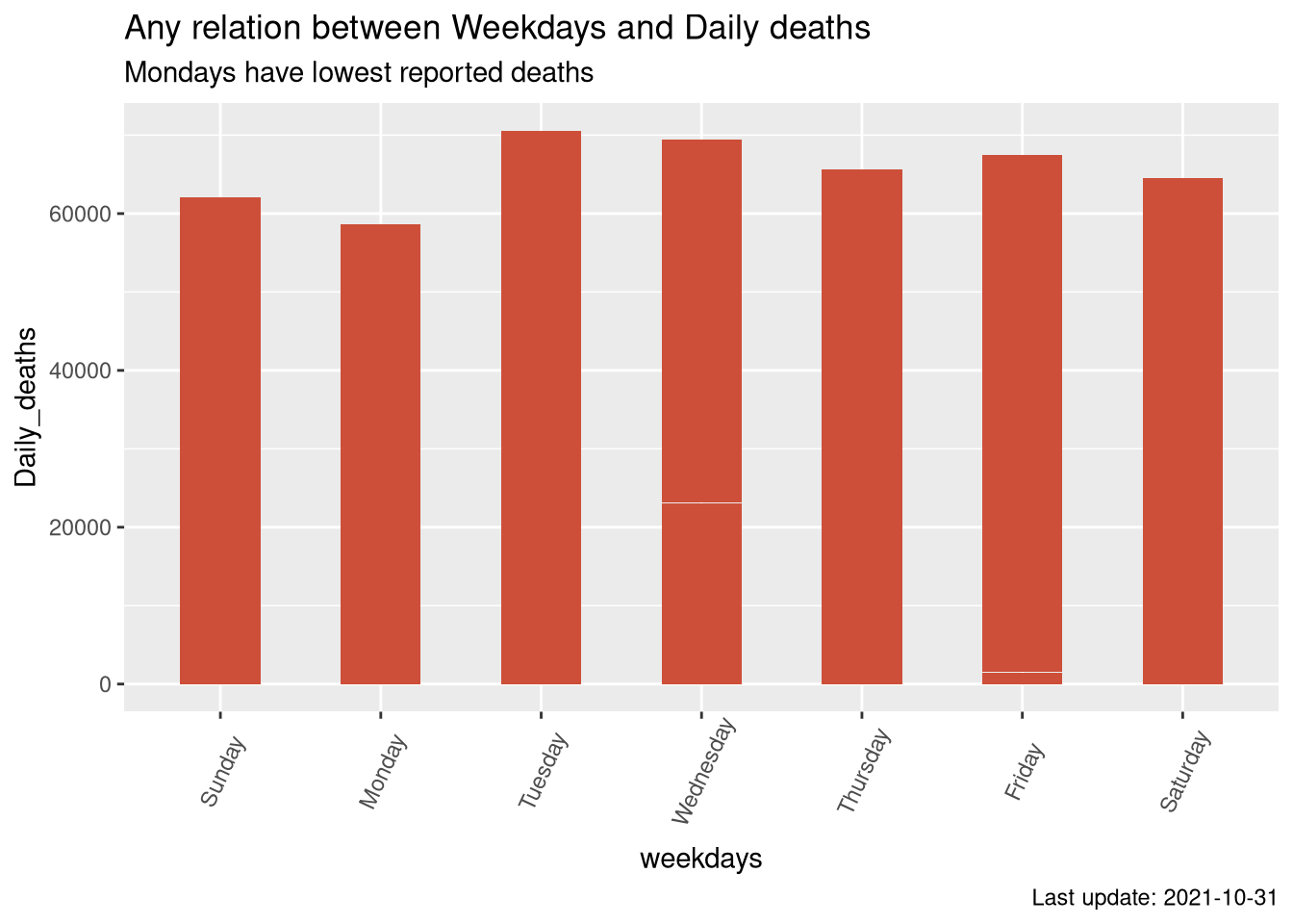
- Mondays record minimum deaths while tuesdays are having higher number of deaths.
Daily cases in India
# Daily cases

active <-  ggplot(India_stats)+
  geom_line(aes(Date,Daily_cases, color ="Daily_cases"),show.legend = F)+
  labs(title="Covid 19 cases in India a time series",
       subtitle="",
       caption= glue("Last update: {max(map_latest$Date)}")) +
  theme(axis.text.x = element_text(angle=65, vjust=0.6),legend.position='none')

covid_time <- ggplotly(active, dynamicTicks = TRUE) %>%
  rangeslider() %>%
  layout(hovermode = "x")

frameWidget(covid_time)
Let’s see some interesting heat maps created using Plotly package.
Covid 19 confirmed cases
Confirmed <- plot_ly(x=states_daily$Date,
               y=states_daily$Code,
               z = states_daily$Confirmed,
               type = "heatmap",
               hoverinfo='text',
               showscale=FALSE ,
               text = ~paste('State: ',states_daily$State, '<br>Date : </br>', states_daily$Date,'<br>Total Confirmed: </br>',states_daily$Confirmed),
              colorscale= "Portland")%>%
  layout(title="Covid 19 cases in Indian states (Cummulative)")


frameWidget(Confirmed)
Deaths during pandemic (Cummulative)
Deaths <- plot_ly(x=states_daily$Date,
               y=states_daily$Code,
               z = states_daily$Daily_deaths,
               type = "heatmap",
               hoverinfo='text',
               showscale=FALSE ,
               text = ~paste('State: ',states_daily$State, '<br>Date : </br>', states_daily$Date,'<br>Deaths </br>',states_daily$Daily_deaths),
               colorscale= "Blackbody") %>%
  layout(title="Life lost in Indian states during Covid 19 pandemic")

frameWidget(Deaths) - Abnormality numbers may occur while states re-evaluate their stats.
Test Positivity Rate (TPR) during pandemic
TPR <- plot_ly(x=states_daily$Date,
               y=states_daily$Code,
               z = states_daily$TPR,
               type = "heatmap",
               showscale=FALSE ,
               hoverinfo='text',
               text = ~paste('State: ',states_daily$State, '<br>Date : </br>', states_daily$Date,'<br>TPR rate:</br>',states_daily$TPR, '<br>Cases today: </br>',states_daily$Daily_cases))%>%
  layout(title="TPR rate in India states during Covid 19 pandemic")

frameWidget(TPR)
Maps tell more stories..
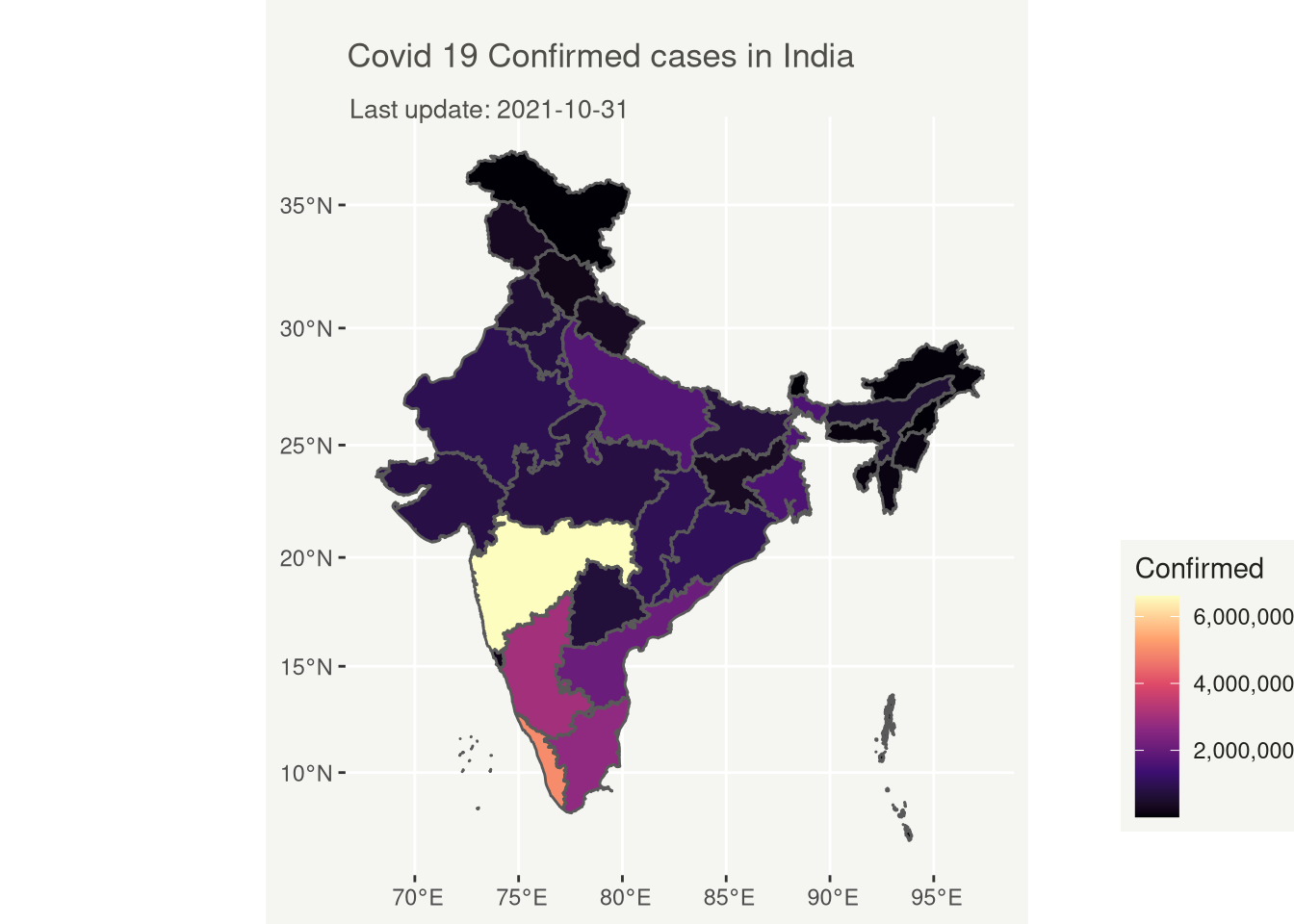
# Covid 19 Confirmed cases in India

ggplot(map_latest)+
geom_sf(aes(fill = Confirmed))+
 scale_fill_viridis_c(option = "magma",labels = comma)+
labs(
    title = "Covid 19 Confirmed cases in India",
    subtitle = glue("Last update: {max(map_latest$Date)}")
  ) +

  theme(
    text = element_text(color = "#22211d"),
    plot.background = element_rect(fill = "#f5f5f2", color = NA),
    panel.background = element_rect(fill = "#f5f5f2", color = NA),
    legend.background = element_rect(fill = "#f5f5f2", color = NA),

    plot.title = element_text(size= 13, hjust=0.01, color = "#4e4d47", margin = margin(b = -0.1, t = 0.4, l = 2, unit = "cm")),
    plot.subtitle = element_text(size= 10, hjust=0.01, color = "#4e4d47", margin = margin(b = -0.1, t = 0.43, l = 2, unit = "cm")),
    plot.caption = element_text( size=12, color = "#4e4d47", margin = margin(b = 0.3, r=-99, unit = "cm") ),

    legend.position = c(1.3, 0.25)
  )
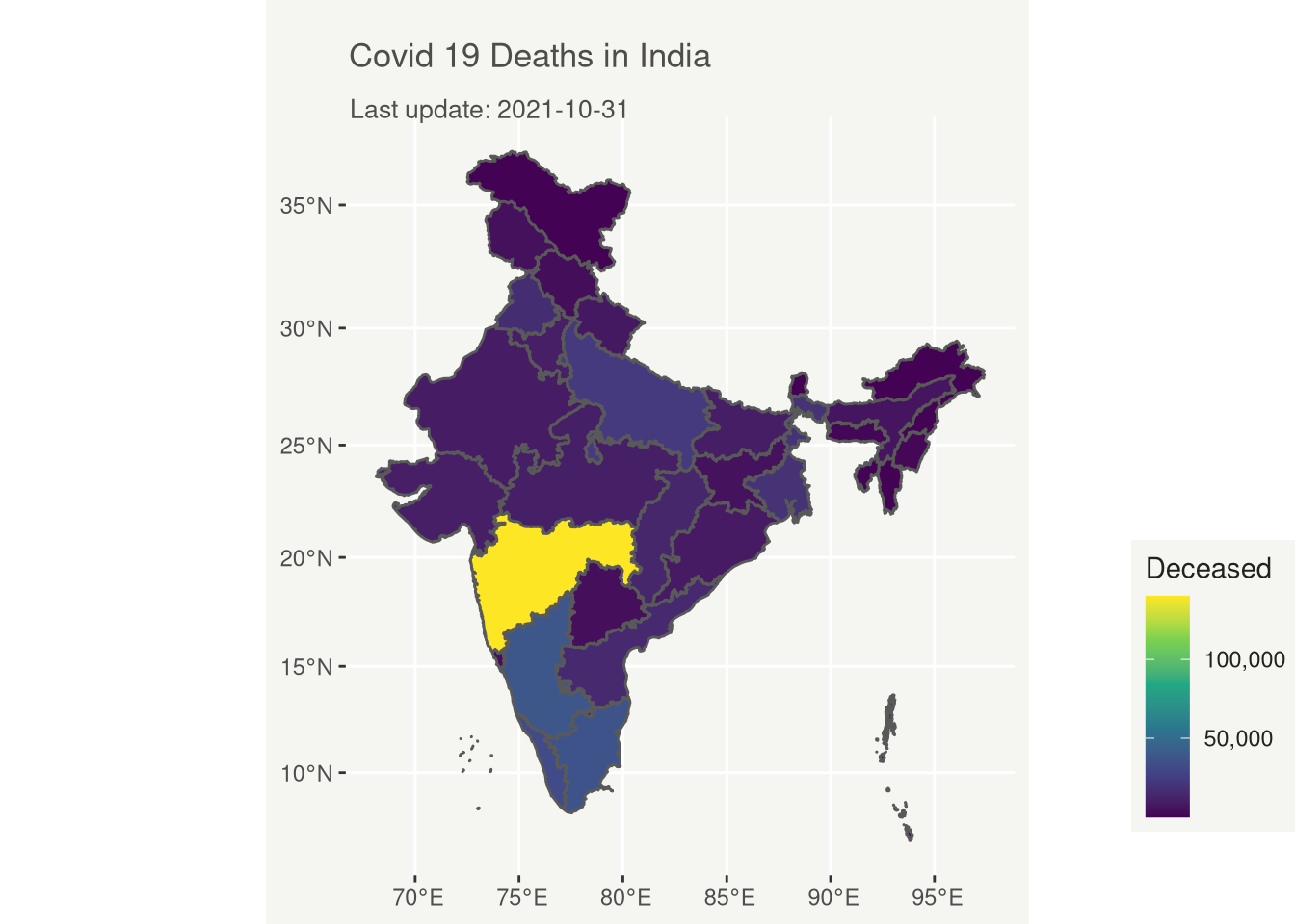
# Covid 19 Deaths in India
ggplot(map_latest)+
geom_sf(aes(fill = Deceased))+
 scale_fill_viridis_c(labels = comma)+
labs(
    title = "Covid 19 Deaths in India",
    subtitle = glue("Last update: {max(map_latest$Date)}")
  ) +

  theme(
    text = element_text(color = "#22211d"),
    plot.background = element_rect(fill = "#f5f5f2", color = NA),
    panel.background = element_rect(fill = "#f5f5f2", color = NA),
    legend.background = element_rect(fill = "#f5f5f2", color = NA),

    plot.title = element_text(size= 13, hjust=0.01, color = "#4e4d47", margin = margin(b = -0.1, t = 0.4, l = 2, unit = "cm")),
    plot.subtitle = element_text(size= 10, hjust=0.01, color = "#4e4d47", margin = margin(b = -0.1, t = 0.43, l = 2, unit = "cm")),
    plot.caption = element_text( size=12, color = "#4e4d47", margin = margin(b = 0.3, r=-99, unit = "cm") ),

    legend.position = c(1.3, 0.25)
  )
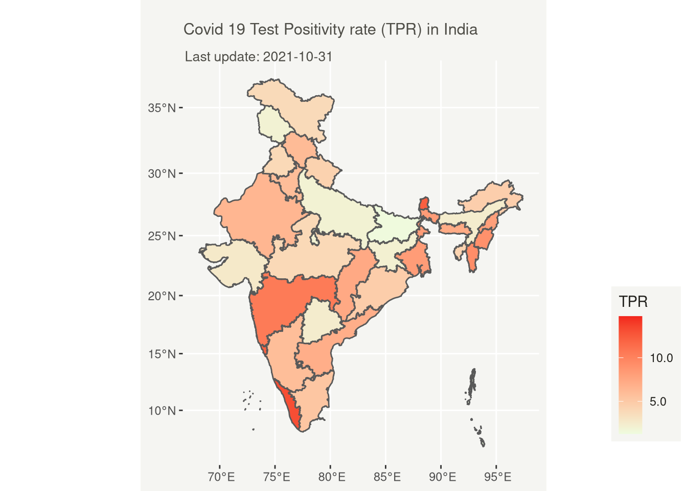
# Covid 19 Test Positivity rate (TPR) in India
ggplot(map_latest)+
geom_sf(aes(fill = TPR))+
 scale_fill_gradient(low = "#EEFCDF", high = "#F2251D",labels = comma)+
labs(
    title = "Covid 19 Test Positivity rate (TPR) in India",
    subtitle = glue("Last update: {max(map_latest$Date)}")
  ) +

  theme(
    text = element_text(color = "#22211d"),
    plot.background = element_rect(fill = "#f5f5f2", color = NA),
    panel.background = element_rect(fill = "#f5f5f2", color = NA),
    legend.background = element_rect(fill = "#f5f5f2", color = NA),

    plot.title = element_text(size= 11.6, hjust=0.01, color = "#4e4d47", margin = margin(b = -0.1, t = 0.4, l = 2, unit = "cm")),
    plot.subtitle = element_text(size= 10, hjust=0.01, color = "#4e4d47", margin = margin(b = -0.1, t = 0.43, l = 2, unit = "cm")),
    plot.caption = element_text( size=12, color = "#4e4d47", margin = margin(b = 0.3, r=-99, unit = "cm") ),

    legend.position = c(1.3, 0.25)
  )
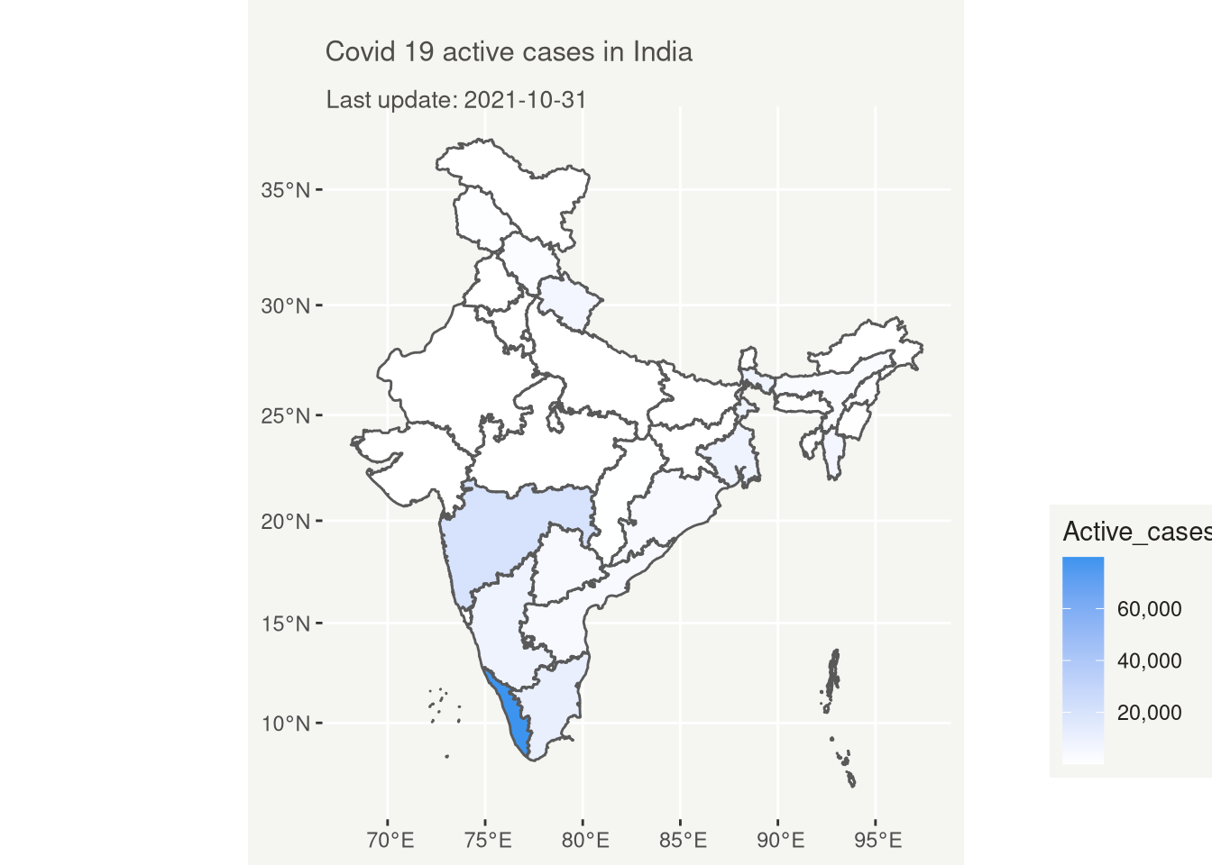
# Covid 19 Active case in India

ggplot(map_latest)+
geom_sf(aes(fill = Active_cases))+
 scale_fill_gradient(low = "white", high = "#3D94EF",labels = comma)+
labs(
    title = "Covid 19 active cases in India",
    subtitle = glue("Last update: {max(map_latest$Date)}")
  ) +

  theme(
    text = element_text(color = "#22211d"),
    plot.background = element_rect(fill = "#f5f5f2", color = NA),
    panel.background = element_rect(fill = "#f5f5f2", color = NA),
    legend.background = element_rect(fill = "#f5f5f2", color = NA),

    plot.title = element_text(size= 11.6, hjust=0.01, color = "#4e4d47", margin = margin(b = -0.1, t = 0.4, l = 2, unit = "cm")),
    plot.subtitle = element_text(size= 10, hjust=0.01, color = "#4e4d47", margin = margin(b = -0.1, t = 0.43, l = 2, unit = "cm")),
    plot.caption = element_text( size=12, color = "#4e4d47", margin = margin(b = 0.3, r=-99, unit = "cm") ),
    legend.position = c(1.3, 0.25)
  )
# Feel free to add intresting questions
Please point out any error you found as soon as possible. Also, comment your thoughts and raise interesting questions so that we can explore this data more.